PAF-516-Code-Through
Drew Radovich
2024-11-30
Choropleth Maps: Creating Effective Visuals and Avoiding Pitfalls
Choropleth maps are an effective visualization tool for showcasing geographical data. Regions are shaded based on a variable of interest allowing for easily discernable differences between geographical tracts. This code-through will provide a walkthrough to creating a choropleth map and how to avoid some of the common pitfalls associated with geographical mapping.
Step 01: Install Packages
To begin creating a choropleth map, we first must download the
required packages. For this example we will use the package
ggplot2. For more interactivity, leaflet can
be used.
# Install required packages if not already installed
install.packages(c("ggplot2", "sf", "dplyr", "tigris"))

# Load the libraries
library(ggplot2) #creating visuallizations
library(sf)     #handling spacial data
library(dplyr)  #data manipulation
library(tigris)  # Or maps for obtaining shapefiles
Step 02: Load Spatial Data
Now that we have the proper tools to read and manipulate our data, we will need to load it. Spatial data can be uploaded from a variety of sources, but we will be using the American Census Survey (ACS) data because it is publicly accesible and contains geographic data from the national level down to census tracts to zip code tabulation areas.
#Dowload US County Shapefiles

options(tigris_use_cache = TRUE)  # Cache for efficiency
counties <- counties(cb = TRUE)  # Download county shapefiles
Alternatively, if you are using a custom shapefile you can download it as such:
Step 03: Prepare Data
Next we will need to prepare the data to match with the chosen shapefile. The dataset should include a geographic identifier (e.g., FIPS code, county level, MSBA, etc.) and a variable that you want to visualize (e.g., median income, rent prices, population density).
# Example data frame
data <- data.frame(
  GEOID = c("01001", "01003", "01005"),  # FIPS codes
  population_density = c(94.3, 125.7, 62.5)
)

# Join your data with the shapefile
choropleth_data <- counties %>%
  left_join(data, by = "GEOID")

# Or, merge with dplyr
## chloropleth_data <- merge( data, by.x="GEOID", by.y="tractid" )

# Make sure there are no empty polygons
chloropleth_data <- chloropleth_data[ ! st_is_empty( chloropleth_data ) , ]
Step 04: Create the Visualization
Again, we will be using ggplot for this part.
ggplot(choropleth_data) +
geom_sf(aes(fill = population_density), color = NA) + # Remove borders with `color = NA`
scale_fill_viridis_c(option = "plasma", name = "Population Density") + # Color scale
theme_minimal() + # Clean background
labs(
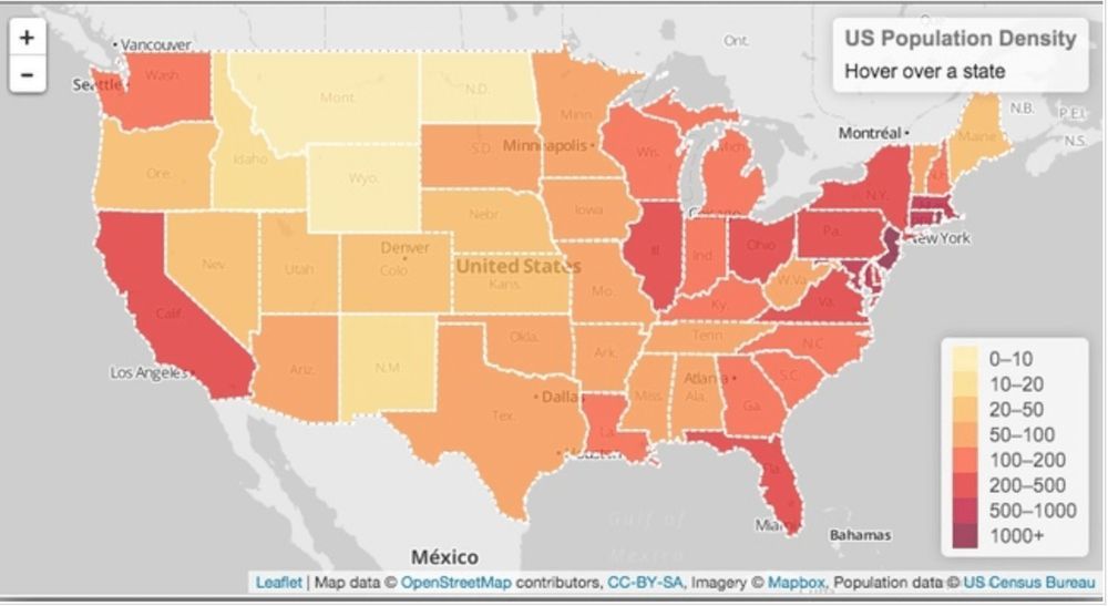
title = "Population Density by County",
subtitle = "United States, 2024",
caption = "Source: Your Data Source"
) +
theme(
plot.title = element_text(size = 18, face = "bold"),
plot.subtitle = element_text(size = 14),
legend.title = element_text(size = 12),
legend.text = element_text(size = 10)
)Tips to Avoid Common Pitfalls
- Use Meaningful Colors
- Choose a color scale that aligns with the data type. For example, if you were plotting average temperatures, use reds for higher temperatures and blues for lower temperatures as this is easily understood worldwide.
- More generally, use a sequential scale to show continuous data (i.e., population density) and a diverging color scale to show deviations.
- The
viridispalette (viridis::scale_fill_viridis_c) ensures readability for colorblind viewers.
- Add Context
- Add a descriptive title, subtitle, and source information including the year that it was compiled
- Use a clear legend and include units for your variable (i.e., if you scale population to the tens of thousands be sure to let the reader know you have done so).
- Avoid Overcrowding
- Try consolodating smaller areas to make the data clearer to understand or focus on the most relevant regions
- Normalize Data and Remove Outliers
- Use normalized data like densities or rates of change opposed to raw numbers so the map is interpreted easier.
Step 05: Enhance the Map
For better visualization, enhance the map by adding state borders or county lines depending on your geographic level.
states <- states(cb = TRUE)  # Get state boundaries

ggplot(choropleth_data) +
  geom_sf(data = states, fill = NA, color = "black", size = 0.3) +  # State borders
  geom_sf(aes(fill = population_density), color = NA) +
  scale_fill_viridis_c(option = "magma", name = "Population Density") +
  theme_void() +
  labs(
    title = "Enhanced Population Density Map",
    subtitle = "Including State Borders",
    caption = "Source: Your Data Source"
  )
Wrap Up
Follow these steps and you should have an effective and visually appealing choropleth map for your data and your audience!